


Behind the Palette: The Art of Colour Selection at Appletons
Published on 21/08/2025
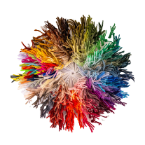
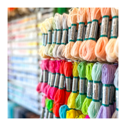
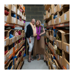
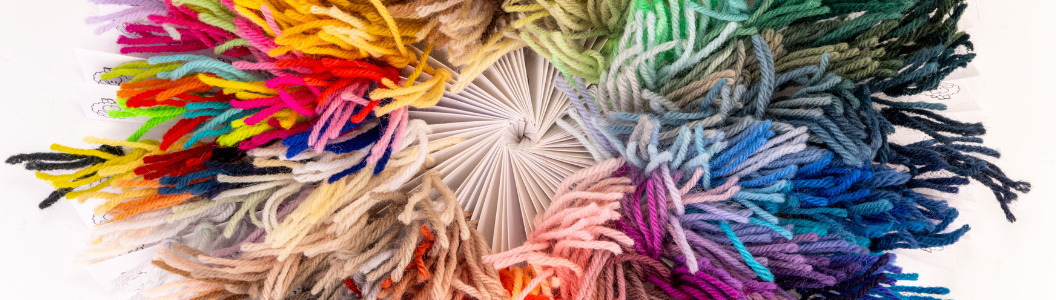
When you pick up an Appletons skein, you’re not just choosing a colour, you’re dipping into a history that stretches back to 1835. That’s nearly two centuries of careful colour curation, experimentation, and, yes, the occasional debate over whether a shade should be “just a touch warmer” or “ever so slightly cooler.”
A palette with history
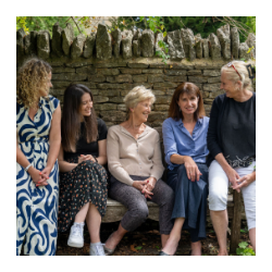
The vast majority of our 390+ colours were already in place when Di, the current owner, took over the company in 2013. That means these shades have been added gradually over the decades, many shaped by the designers of their time. Some of our original colours which date back to the 19th Century are the same as those used by William Morris. Imagine the conversations that might have taken place over choosing that perfect deep green or earthy red!
How we’ve evolved
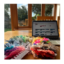
Since 2013, we’ve been looking at our palette with fresh eyes. Where were the gaps? Which colours were missing? And how could we reflect the way stitching is being enjoyed today?
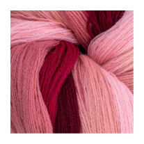
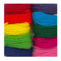
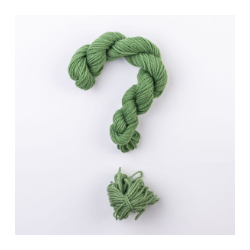
Traditionally, tapestry and embroidery were seen as a pastime for older generations, with kits often designed around classic or formal styles. But in recent years, everything has shifted. Craft has had a real resurgence, people are embracing its wellbeing benefits, and our community now spans all ages. With that has come a more contemporary palette – think playful shades like Bubblegum or Fizzy Sherbet, designed to bring a burst of fun to modern homes. Brighter interiors have inspired brighter threads, whether they’re destined for a cushion, a wall hanging, or even a bold piece of wearable art.
Science behind the shades
Of course, colour at Appletons isn’t just about trends or taste, there’s a lot of science at play too. Wool needs to be dyed in weak acidic conditions (alkalis, sadly, are its worst enemy), so we use acid levelling dyes to achieve rich, reliable tones. This careful process means our colours don’t just look beautiful, they’ll also stay strong and fading is minimised.
Consistency is equally important. We work with our dyers to make sure that every batch is repeatable, so whether you’re finishing a project today or topping up your stash in two years’ time.
We try our best to ensure the colour matches. We’re sometimes asked why we don’t use natural dyes, and the answer is simple: while they’re wonderful in some contexts, they just don’t offer the precision and consistency that embroidery and tapestry demand. Natural dyes can create uneven depths within a single hank, and reproducing a shade exactly is next to impossible. Which isn’t ideal when you need confidence that your chosen colour will stay true.
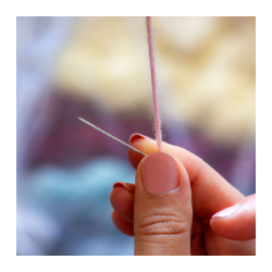
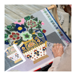
Tips for matching colour
One of the questions we’re asked most often is how to select and combine colours. Here are a few of our favourite tips:
- Think in families – Start with a base colour you love, then explore lighter and darker shades in the same family to add depth.
- Balance bolds with neutrals – Pairing a zingy shade like Fizzy Sherbet with softer, earthy tones can stop your project from feeling overwhelming.
- Use nature as your guide – Flowers, landscapes, even the changing seasons offer endless colour inspiration that always feels harmonious.
- Trust your instinct – Sometimes, the best combinations come from simply playing around and seeing what feels right to you.
At Appletons, colour isn’t just our business, it’s our passion. From heritage shades that have stood the test of time to the playful brights inspired by today’s homes and lifestyles, our palette continues to grow with you.
Ready to find your perfect match? Explore our full colour range here.